Understanding Synthetic Control Methods

A detailed introduction to one of the most popular causal inference techniques in the industry
It is now widely accepted that the gold standard technique to compute the causal effect of a treatment (a drug, ad, product, …) on an outcome of interest (a disease, firm revenue, customer satisfaction, …) is AB testing, a.k.a. randomized experiments. We randomly split a set of subjects (patients, users, customers, …) into a treatment and a control group and give the treatment to the treatment group. This procedure ensures that, ex-ante, the only expected difference between the two groups is caused by the treatment.
One of the key assumptions in AB testing is that there is no contamination between treatment and control group. Giving a drug to one patient in the treatment group does not affect the health of patients in the control group. This might not be the case for example if we are twying to cure a contageous disease and the two groups are not isolated. In the industry, frequent violations of the contamination assumption are network effects - my utility of using a social network increases as the number of friends on the network increases - and general equilibrium effects - if I improve one product, it might decrease the sales of another similar product.
Because of this reason, often experiments are carried out at a sufficiently large scale so that there is no contamination across groups, such as cities, states or even countries. Then another problem arises because of the larger scale: the treatment becomes more expensive. Giving a drug to 50% of patients in a hospital is much less expensive than giving a drug to 50% of cities in a country. Therefore, often only few units are treated but often over a longer period of time.
In these settings, a very powerful method emerged around 10 years age: Synthetic Control. The idea of synthetic control is to exploit the temporal variation in the data instead of the cross-sectional one (across time instead of across units). This method is extremely popular in the industry - e.g. in companies like Google, Uber, Facebook, Microsoft, Amazon - because it is easy to interpret and deals with a setting that emerges often at large scales. In this post we are going to explore this technique by means of example: we will investigate the effectiveness of self-driving cars for a ride-sharing platform.
Self-Driving Cars
Suppose you were a ride-sharing platform and you wanted to test the effect of self-driving cars in your fleet.
As you can imagine, there are many limitations to running an AB/test for this type of feature. First of all, it’s complicated to randomize individual rides. Second, it’s a very expensive intervention. Third, and statistically most important, you cannot run this intervention at the ride level. The problem is that there are spillover effects from treated to control units: if indeed self-driving cars are more efficient, it means that they can serve more customers in the same amount of time, reducing the customers available to normal drivers (the control group). This spillover contaminates the experiment and prevents a causal interpretation of the results.
For all these reasons, we select only one city. Given the synthetic vibe of the article we cannot but select… (drum roll)… Miami!

I generate a simulated dataset in which we observe a panel of U.S. cities over time. The revenue data is made up, while the socio-economic variables are taken from the OECD database. I import the data generating process dgp_selfdriving() from src.dgp. I also import some plotting functions and libraries from src.utils.
%matplotlib inline
%config InlineBackend.figure_format = 'retina'
from src.utils import *
from src.dgp import dgp_selfdriving

treatment_year = 2013
treated_city = 'Miami'
df = dgp_selfdriving().generate_data(year=treatment_year, city=treated_city)
df.head()
| city | year | density | employment | gdp | population | treated | post | revenue | |
|---|---|---|---|---|---|---|---|---|---|
| 0 | Atlanta | 2003 | 290 | 0.629761 | 6.4523 | 4.267538 | False | False | 25.713947 |
| 1 | Atlanta | 2004 | 295 | 0.635595 | 6.5836 | 4.349712 | False | False | 23.852279 |
| 2 | Atlanta | 2005 | 302 | 0.645614 | 6.6998 | 4.455273 | False | False | 24.332397 |
| 3 | Atlanta | 2006 | 313 | 0.648573 | 6.5653 | 4.609096 | False | False | 23.816017 |
| 4 | Atlanta | 2007 | 321 | 0.650976 | 6.4184 | 4.737037 | False | False | 25.786902 |
We have information on the largest 46 U.S. cities for the period 2002-2019. The panel is balanced, which means that we observe all cities for all time periods. Self-driving cars were introduced in 2013.
Is the treated unit, Miami, comparable to the rest of the sample? Let’s use the create_table_one function from Uber’s causalml package to produce a covariate balance table, containing the average value of our observable characteristics, across treatment and control groups. As the name suggests, this should always be the first table you present in causal inference analysis.
from causalml.match import create_table_one

create_table_one(df, 'treated', ['density', 'employment', 'gdp', 'population', 'revenue'])
| Control | Treatment | SMD | |
|---|---|---|---|
| Variable | |||
| n | 765 | 17 | |
| density | 256.63 (172.90) | 364.94 (19.61) | 0.8802 |
| employment | 0.63 (0.05) | 0.60 (0.04) | -0.5266 |
| gdp | 6.07 (1.16) | 5.12 (0.29) | -1.1124 |
| population | 3.53 (3.81) | 5.85 (0.31) | 0.861 |
| revenue | 25.25 (2.45) | 23.86 (2.39) | -0.5737 |
As expected, the groups are not balanced: Miami is more densely populated, poorer, larger and has lower employment rate than the other cities in the US in our sample.
We are interested in understanding the impact of the introduction of self-driving cars on revenue.
One initial idea could be to analyze the data as we would in an A/B test, comparing control and treatment group. We can estimate the treatment effect as a difference in means in revenue between the treatment and control group, after the introduction of self-driving cars.
smf.ols('revenue ~ treated', data=df[df['post']==True]).fit().summary().tables[1]
| coef | std err | t | P>|t| | [0.025 | 0.975] | |
|---|---|---|---|---|---|---|
| Intercept | 26.6006 | 0.127 | 210.061 | 0.000 | 26.351 | 26.850 |
| treated[T.True] | -0.7156 | 0.859 | -0.833 | 0.405 | -2.405 | 0.974 |
The effect of self-driving cars seems to be negative but not significant.
The main problem here is that treatment was not randomly assigned. We have a single treated unit, Miami, and it’s hardly comparable to other cities.
One alternative procedure, is to compare revenue before and after the treatment, within the city of Miami.
smf.ols('revenue ~ post', data=df[df['city']==treated_city]).fit().summary().tables[1]
| coef | std err | t | P>|t| | [0.025 | 0.975] | |
|---|---|---|---|---|---|---|
| Intercept | 22.4485 | 0.534 | 42.044 | 0.000 | 21.310 | 23.587 |
| post[T.True] | 3.4364 | 0.832 | 4.130 | 0.001 | 1.663 | 5.210 |
The effect of self-driving cars seems to be positive and statistically significant.
However, the problem of this procedure is that there might have been many other things happening after 2013. It’s quite a stretch to attribute all differences to self-driving cars.
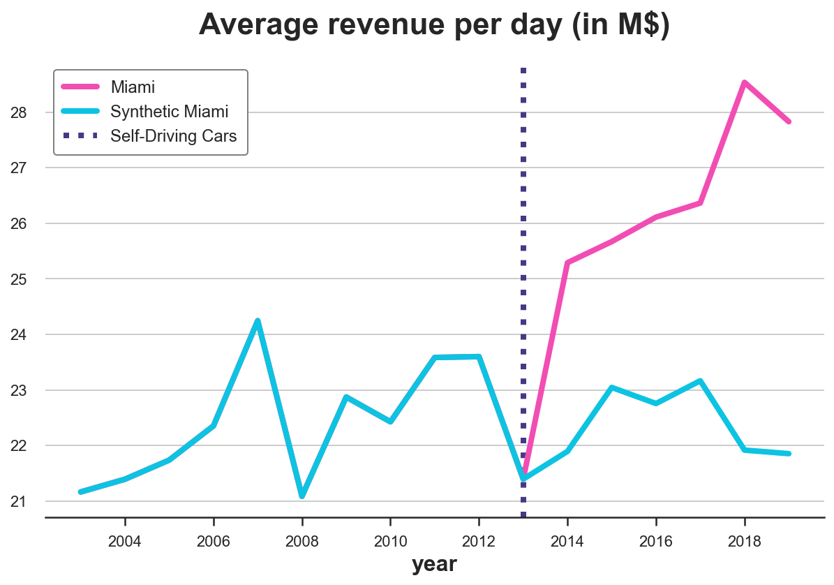
We can better understand this concern if we plot the time trend of revenue over cities. First, we need to reshape the data into a wide format, with one column per city and one row per year.
df = df.pivot(index='year', columns='city', values='revenue').reset_index()
Now, let’s plot the revenue over time for Miami and for the other cities.
cities = [c for c in df.columns if c!='year']
df['Other Cities'] = df[[c for c in cities if c != treated_city]].mean(axis=1)
def plot_lines(df, line1, line2, year, hline=True):
    sns.lineplot(x=df['year'], y=df[line1].values, label=line1)
    sns.lineplot(x=df['year'], y=df[line2].values, label=line2)
    plt.axvline(x=year, ls=":", color='C2', label='Self-Driving Cars', zorder=1)
    plt.legend();
    plt.title("Average revenue per day (in M$)");
Since we are talking about Miami, let’s use an appropriate color palette.
sns.set_palette(sns.color_palette(['#f14db3', '#0dc3e2', '#443a84']))
plot_lines(df, treated_city, 'Other Cities', treatment_year)
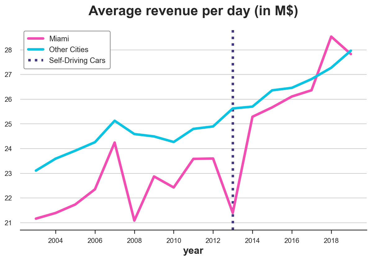
As we can see, revenue seems to be increasing after the treatment in Miami. But it’s a very volatile time series. And revenue was increasing also in the rest of the country. It’s very hard from this plot to attribute the change to self-driving case.
Can we do better?
Synthetic Control
The answer is yes! Synthetic control allow us to do causal inference when we have as few as one treated unit and many control units and we observe them over time. The idea is simple: combine untreated units so that they mimic the behavior of the treated unit as closely as possible, without the treatment. Then use this “synthetic unit” as a control. The method first introduced by Abadie, Diamond and Hainmueller (2010) and has been called “the most important innovation in the policy evaluation literature in the last few years”. Moreover, it is widely used in the industry because of its simplicity and interpretability.
Setting
We assume that for a panel of i.i.d. subjects $i = 1, …, n$ over time $t=1, …,T$ we observed a set of variables $(X_{it}, D_i, Y_{it})$ that includes
- a treatment assignment $D_i \in \lbrace 0, 1 \rbrace$ (
treated) - a response $Y_{i,t} \in \mathbb R$ (
revenue) - a feature vector $X_{i,t} \in \mathbb R^n$ (
population,density,employmentandGDP)
Moreover, one unit (Miami in our case) is treated at time $t^*$ (2013 in our case). We distinguish time periods before treatment and time periods after treatment.
Crucially, treatment $D_i$ is not randomly assigned, therefore a difference in means between the treated unit(s) and the control group is not an unbiased estimator of the average treatment effect.
The Problem
The problem is that, as usual, we do not observe the counterfactual outcome for treated units, i.e. we do not know what would have happened to them, if they had not been treated. This is known as the fundamental problem of causal inference.
The simplest approach, would be just to compare pre and post periods. This is called the event study approach.
However, we can do better than this. In fact, even though treatment was not randomly assigned, we still have access to some units that were not treated.
For the outcome variable we observe the following values
$$ Y = \begin{bmatrix} Y^{(1)} _ {t, post} \ & Y^{(0)} _ {c, post} \newline Y^{(0)} _ {t, pre} \ & Y^{(0)} _ {c, pre} \end{bmatrix} $$
Where $Y^{(d)} _ {a, t}$ is the outcome of an observation at time $t$, given treatment assignment $a$ and treatment status $d$. We basically have a missing data problem since we do not observe $Y^{(0)} _ {t, post}$: what would have happened to treated units ($a=t$) without treatment ($d=0$).
The Solution
Following Doudchenko and Inbens (2018), we can formulate an estimate of the counterfactual outcome for the treated unit as a linear combination of the observed outcomes for the control units.
$$ \hat Y^{(0)} _ {t, post} = \alpha + \sum_{i \in c} \beta_{i} Y^{(0)} _ {i, post} $$
where
- the constant $\alpha$ allows for different averages between the two groups
- the weights $\beta_i$ are allowed to vary across control units $i$ (otherwise, it would be a difference-in-differences)
How should we choose which weights to use? We want our synthetic control to approximate the outcome as closely as possible, before the treatment. The first approach could be to define the weights as
$$ \hat \beta = \arg \min_{\beta} || \boldsymbol X_{t, pre} - \boldsymbol \beta \boldsymbol X_{c, pre} || = \sqrt{ \sum_{p} \left( X_{t, p, pre} - \sum_{i \in c} \beta_{p} X_{c, p, pre} \right)^2 } $$
I.e. the weights are such that they minimize the distance between observable characteristics of control units $X_c$ and the treated unit $X_t$ before the treatment.
You might notice a very close similarity to linear regression. Indeed, we are doing something very similar.
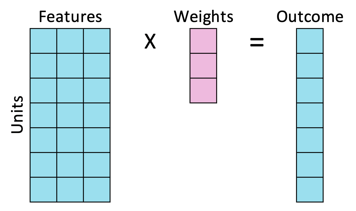
In linear regression, we usually have many units (observations), few exogenous features and one endogenous feature and we try to express the endogenous feature as a linear combination of the endogenous features, for each unit.
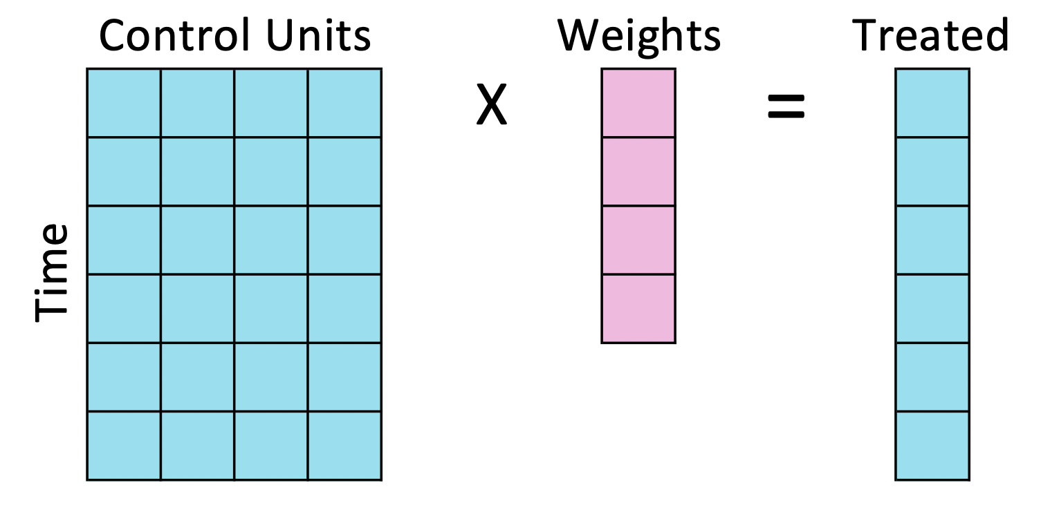
With synthetic control, we instead have many time periods (features), few control units and a single treated unit and we try to express the treated unit as a linear combination of the control units, for each time period.
To perform the same operation, we essentially need to transpose the data.
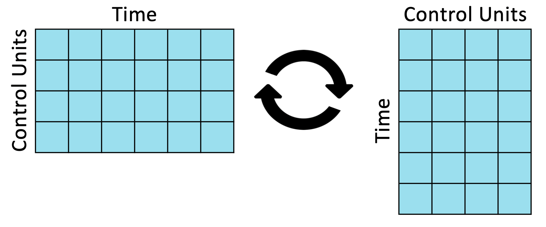
After the swap, we compute the synthetic control weights, exactly as we would compute regression coefficients. However now one observation is a time period and one feature is a unit.
Notice that this swap is not innocent. In linear regression we assume that the relationship between the exogenous features and the endogenous feature is the same across units, instead in synthetic control we assume that the relationship between the treated units and the control unit is the same over time.
Back to self-driving cars
Let’s go back to the data now! First, we write a synth_predict function that takes as input a model that is trained on control cities and tries to predict the outcome of the treated city, Miami, before the introduction of self-driving cars.
def synth_predict(df, model, city, year):
    other_cities = [c for c in cities if c not in ['year', city]]
    y = df.loc[df['year'] <= year, city]
    X = df.loc[df['year'] <= year, other_cities]
    df[f'Synthetic {city}'] = model.fit(X, y).predict(df[other_cities])
    return model
Let’s estimate the model via linear regression.
from sklearn.linear_model import LinearRegression

coef = synth_predict(df, LinearRegression(), treated_city, treatment_year).coef_
How well did we match pre-self-driving cars revenue in Miami? What is the implied effect of self-driving cars?
We can visually answer both questions by plotting the actual revenue in Miami against the predicted one.
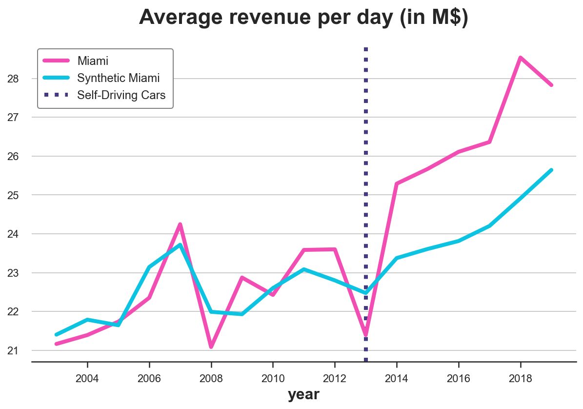
plot_lines(df, treated_city, f'Synthetic {treated_city}', treatment_year)
It looks like self-driving cars had a sensible positive effect on revenue in Miami: the predicted trend is lower than the actual data and diverges right after the introduction of self-driving cars.
On the other hand, we are clearly overfitting: the pre-treatment predicted revenue line is perfectly overlapping with the actual data. Given the high variability of revenue in Miami, this is suspicious, to say the least.
Another problem concerns the weights. Let’s plot them.
df_states = pd.DataFrame({'city': [c for c in cities if c!=treated_city], 'ols_coef': coef})
plt.figure(figsize=(10, 9))
sns.barplot(data=df_states, x='ols_coef', y='city');
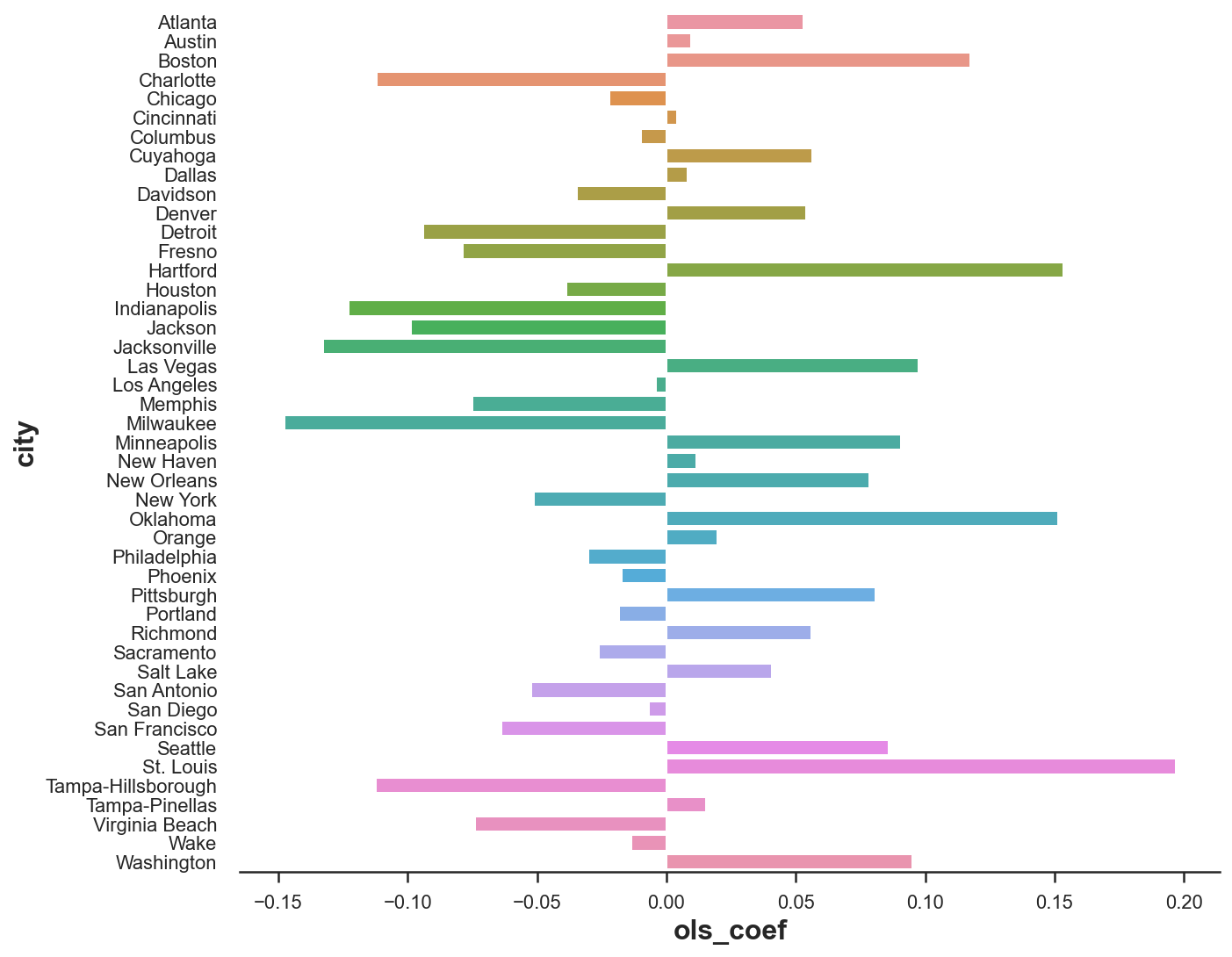
We have many negative weights, which do not make much sense from a causal inference perspective. I can understand that Miami can be expressed as a combination of 0.2 St. Louis, 0.15 Oklahoma and 0.15 Hartford. But what does it mean that Miami is -0.15 Milwaukee?
Since we would like to interpret our synthetic control as a weighted average of untreated states, all weights should be positive and they should sum to one.
To address both concerns (weighting and overfitting), we need to impose some restrictions on the weights.
Extensions
Weights
To solve the problems of overweighting and negative weights, Abadie, Diamond and Hainmueller (2010) propose the following weights:
$$ \hat \beta = \arg \min_{\beta} || \boldsymbol X_t - \boldsymbol \beta \boldsymbol X_c || = \sqrt{ \sum_{p} \left( X_{t, p} - \sum_{i \in c} \beta_{p} X_{c, p} \right)^2 } \quad \text{s.t.} \quad \sum_{p} \beta_p = 1 \quad \text{and} \quad \beta_p \geq 0 \quad \forall p $$
Which means, a set of weights $\beta$ such that
-
weighted observable characteristics of the control group $X_c$, match the observable characteristics of the treatment group $X_t$, before the treatment
-
they sum to 1
-
and are not negative.
With this approach we get an interpretable counterfactual as a weighted avarage of untreated units.
Let’s write now our own objective function. I create a new class SyntheticControl() which has both a loss function, as described above, a method to fit it and predict the values for the treated unit.
from toolz import partial
from scipy.optimize import fmin_slsqp

class SyntheticControl():

    # Loss function
    def loss(self, W, X, y) -> float:
        return np.sqrt(np.mean((y - X.dot(W))**2))

    # Fit model
    def fit(self, X, y):
        w_start = [1/X.shape[1]]*X.shape[1]
        self.coef_ = fmin_slsqp(partial(self.loss, X=X, y=y),
                         np.array(w_start),
                         f_eqcons=lambda x: np.sum(x) - 1,
                         bounds=[(0.0, 1.0)]*len(w_start),
                         disp=False)
        self.mse = self.loss(W=self.coef_, X=X, y=y)
        return self

    # Predict
    def predict(self, X):
        return X.dot(self.coef_)
We can now repeat the same procedure as before, but using the SyntheticControl method instead of the simple, unconstrained LinearRegression.
df_states['coef_synth'] = synth_predict(df, SyntheticControl(), treated_city, treatment_year).coef_
plot_lines(df, treated_city, f'Synthetic {treated_city}', treatment_year)
As we can see, now we are not overfitting anymore. The actual and predicted revenue pre-treatment are close but not identical. The reason is that the non-negativity constraint is constraining most coefficients to be zero (as Lasso does).
It looks like the effect is again negative. However, let’s plot the difference between the two lines to better visualize the magnitude.
def plot_difference(df, city, year, vline=True, hline=True, **kwargs):
    sns.lineplot(x=df['year'], y=df[city] - df[f'Synthetic {city}'], **kwargs)
    if vline:
        plt.axvline(x=year, ls=":", color='C2', label='Self-driving cars', lw=3, zorder=100)
        plt.legend()
    if hline: sns.lineplot(x=df['year'], y=0, lw=3, color='k', zorder=1)
    plt.title("Estimated effect of self-driving cars");
plot_difference(df, treated_city, treatment_year)
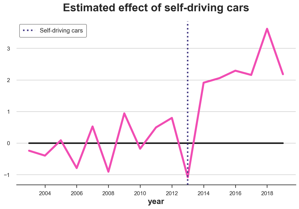
The difference is clearly positive and slightly increasing over time.
We can also visualize the weights to interpret the estimated counterfactual (what would have happened in Miami, without self-driving cars).
plt.figure(figsize=(10, 9))
sns.barplot(data=df_states, x='coef_synth', y='city');
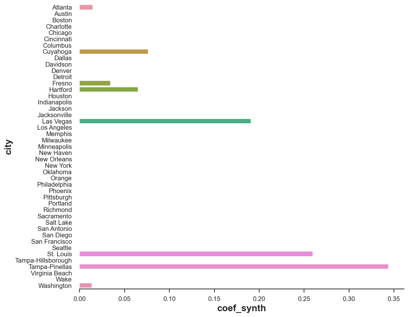
As we can see, now we are expressing revenue in Miami as a linear combination of just a couple of cities: Tampa, St. Louis and, to a lower extent, Las Vegas. This makes the whole procedure very transparent.
Inference
What about inference? Is the estimate significantly different from zero? Or, more practically, “how unusual is this estimate under the null hypothesis of no policy effect?”.
We are going to perform a randomization/permutation test in order to answer this question. The idea is that if the policy has no effect, the effect we observe for Miami should not be significantly different from the effect we observe for any other city.
Therefore, we are going to replicate the procedure above, but for all other cities and compare them with the estimate for Miami.
from matplotlib.offsetbox import OffsetImage, AnnotationBbox

fig, ax = plt.subplots()
for city in cities:
    synth_predict(df, SyntheticControl(), city, treatment_year)
    plot_difference(df, city, treatment_year, vline=False, alpha=0.2, color='C1', lw=3)
plot_difference(df, treated_city, treatment_year)
ax.add_artist(AnnotationBbox(OffsetImage(plt.imread('fig/miami.png'), zoom=0.25), (2015, 2.7), frameon=False));
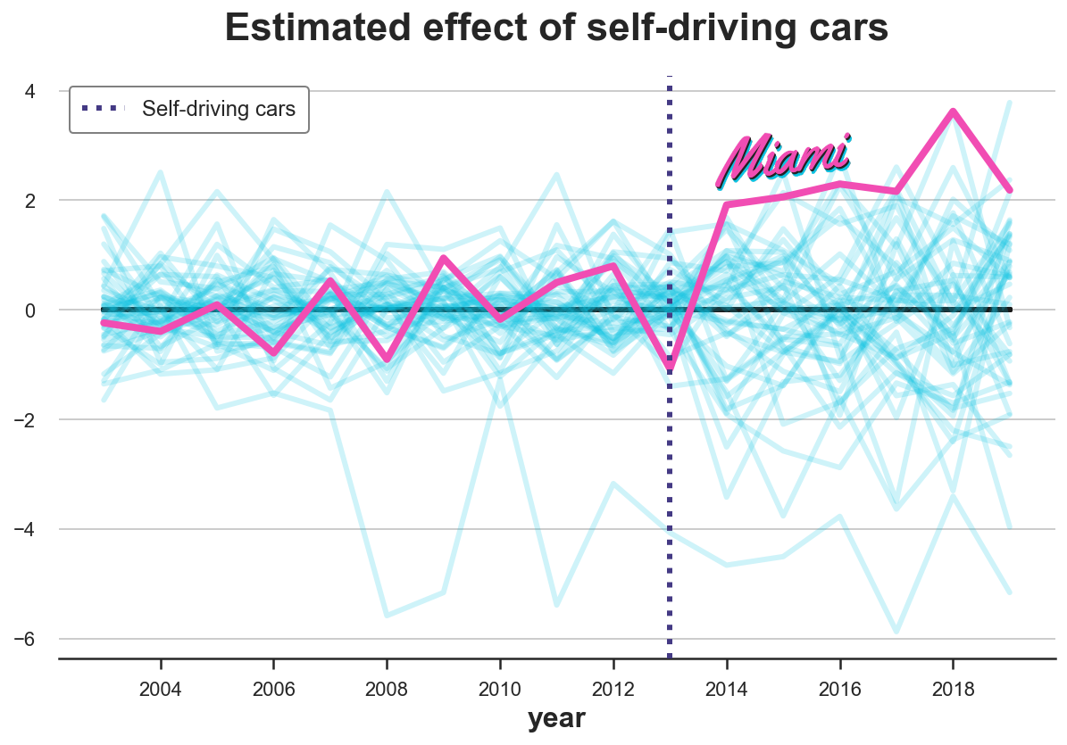
From the graph we notice two things. First, the effect for Miami is quite extreme and therefore likely not to be driven by random noise.
Second, we also notice that there are a couple of cities for which we cannot fit the pre-trend very well. In particular, there is a line that is sensibly lower than all others. This is expected since, for each city, we are building the counterfactual trend as a convex combination of all other cities. Cities that are quite extreme in terms of revenue are very useful to build the counterfactuals of other cities, but it’s hard to build a counterfactual for them.
Not to bias the analysis, let’s exclude states for which we cannot build a “good enough” counterfectual, in terms of pre-treatment MSE.
$$ MSE_{pre} = \frac{1}{n} \sum_{t \in \text{pre}} \left( Y_t - \hat Y_t \right)^2 $$
As a rule of thumb, Abadie, Diamond and Hainmueller (2010) suggest to exclude units for which the prediction MSE is larger than twice the MSE of the treated unit.
# Reference mse
mse_treated = synth_predict(df, SyntheticControl(), treated_city, treatment_year).mse

# Other mse
fig, ax = plt.subplots()
for city in cities:
    mse = synth_predict(df, SyntheticControl(), city, treatment_year).mse
    if mse < 2 * mse_treated:
        plot_difference(df, city, treatment_year, vline=False, alpha=0.2, color='C1', lw=3)
plot_difference(df, treated_city, treatment_year)
ax.add_artist(AnnotationBbox(OffsetImage(plt.imread('fig/miami.png'), zoom=0.25), (2015, 2.7), frameon=False));
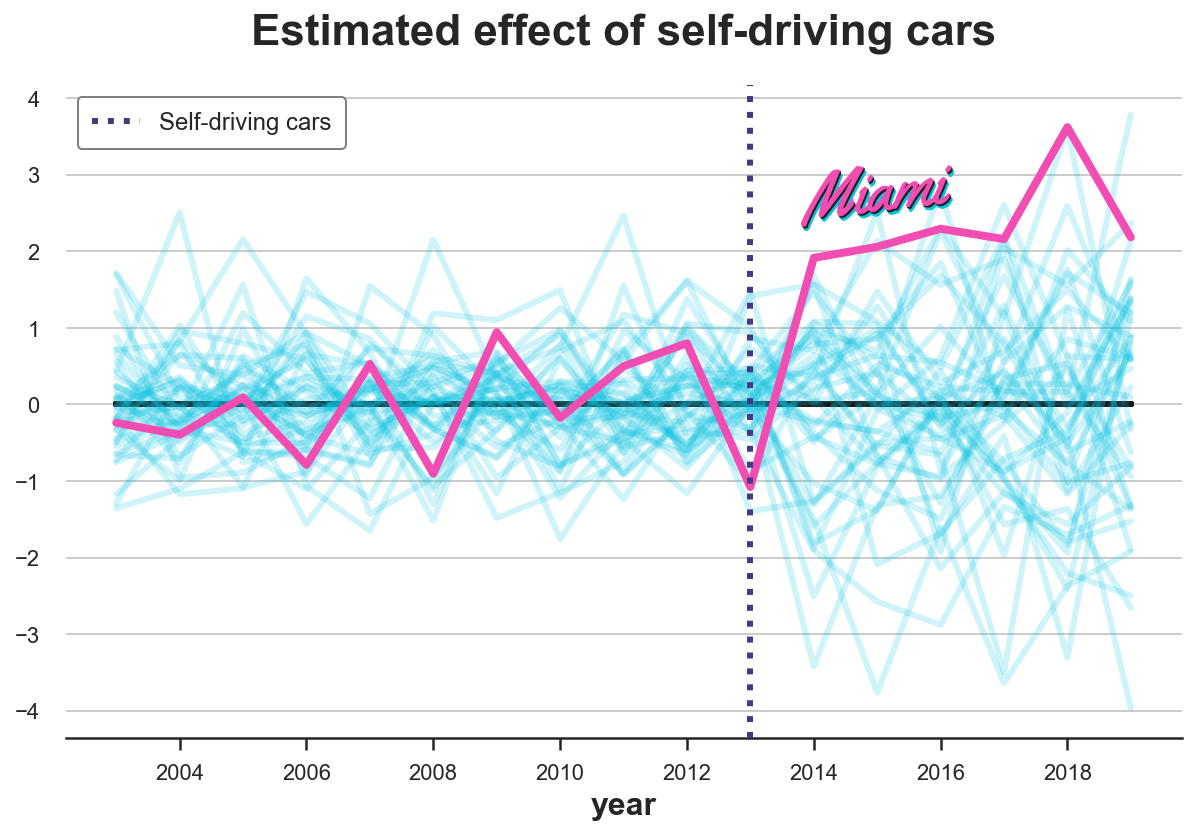
After exluding extreme observations, it looks like the effect for Miami is very unusual.
One statistic that Abadie, Diamond and Hainmueller (2010) suggest to perform a randomization test is the ratio between pre-treatment MSE and post-treatment MSE.
$$ \lambda = \frac{MSE_{post}}{MSE_{pre}} = \frac{\frac{1}{n} \sum_{t \in \text{post}} \left( Y_t - \hat Y_t \right)^2 }{\frac{1}{n} \sum_{t \in \text{pre}} \left( Y_t - \hat Y_t \right)^2 } $$
We can compute a p-value as the number of observations with higher ratio.
lambdas = {}
for city in cities:
    mse_pre = synth_predict(df, SyntheticControl(), city, treatment_year).mse
    mse_tot = np.mean((df[f'Synthetic {city}'] - df[city])**2)
    lambdas[city] = (mse_tot - mse_pre) / mse_pre

print(f"p-value: {np.mean(np.fromiter(lambdas.values(), dtype='float') > lambdas[treated_city]):.4}")
p-value: 0.04348
It seems that only $4.3%$ of the cities had a larger MSE ratio than Miami, implying a p-value of 0.043. We can visualize the distribution of the statistic under permutation with a histogram.
fig, ax = plt.subplots()
_, bins, _ = plt.hist(lambdas.values(), bins=20, color="C1");
plt.hist([lambdas[treated_city]], bins=bins)
plt.title('Ratio of $MSE_{post}$ and $MSE_{pre}$ across cities');
ax.add_artist(AnnotationBbox(OffsetImage(plt.imread('fig/miami.png'), zoom=0.25), (2.7, 1.7), frameon=False));
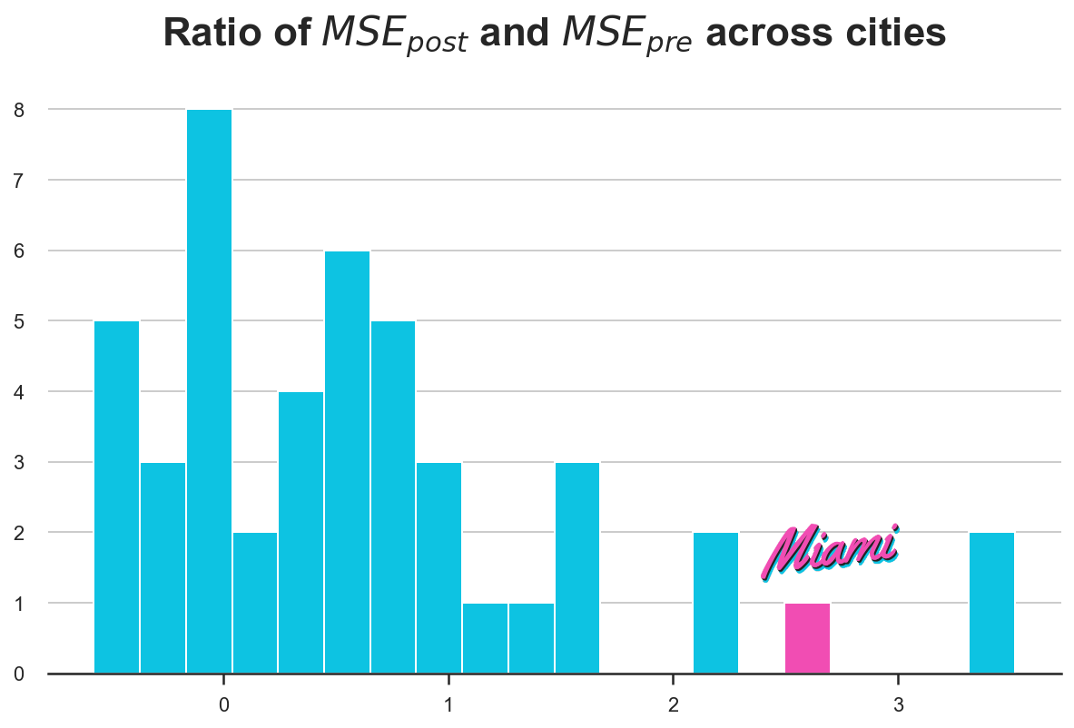
Indeed, the statistic for Miami is quite extreme.
Conclusion
In this article, we have explored a very popoular method for causal inference when we have few treated units, but many time periods. This setting emerges often in industry settings when the treatment has to be assigned at the aggregate level and randomization might not be possible. The key idea of synthetic control is to combinate control units into one syntetic control unit to use as counterfactual to estimate the causal effect of the treatment.
One of the main advantages of synthetic control is that, as long as we use positive weights that are constrained to sum to one, the method avoids extrapolation: we will never go out of the support of the data. Moreover, synthetic control studies can be “pre-registered”: you can specify the weights before the study to avoid p-hacking and cherry picking. Another reason why this method is so popular in the industry is that weights make the counterfactual analysis explicit: one can look at the weights and understand which comparison we are making.
This method is relatively young and many extensions are appearing every year. Some notable ones are the generalyzed synthetic control by Xu (2017), the synthetic difference-in-differences by Doudchenko and Imbens (2017), the penalyzed synthetic control of Abadie e L’Hour (2020) and the matrix completion methods of Athey et al. (2021). Last but not least, if you want to have the method explained by one of its inventors, there is this great lecture by Alberto Abadie at the NBER Summer Institute freely available on Youtube.
References
[1] A. Abadie, A. Diamond and J. Hainmueller, Synthetic Control Methods for Comparative Case Studies: Estimating the Effect of California’s Tobacco Control Program (2010), Journal of the American Statistical Association.
[2] A. Abadie, Using Synthetic Controls: Feasibility, Data Requirements, and Methodological Aspects (2021), Journal of Economic Perspectives.
[3] N. Doudchenko, G. Imbens, Balancing, Regression, Difference-In-Differences and Synthetic Control Methods: A Synthesis (2017), working paper.
[4] Y. Xu, Generalized Synthetic Control Method: Causal Inference with Interactive Fixed Effects Models (2018), Political Analysis.
[5] A. Abadie, J. L’Hour, A Penalized Synthetic Control Estimator for Disaggregated Data (2020), Journal of the American Statistical Association.
[6] S. Athey, M. Bayati, N. Doudchenko, G. Imbens, K. Khosravi, Matrix Completion Methods for Causal Panel Data Models (2021), Journal of the American Statistical Association.
Related Articles
Code
You can find the original Jupyter Notebook here:
https://github.com/matteocourthoud/Blog-Posts/blob/main/notebooks/synth.ipynb
I hold a PhD in economics from the University of Zurich. Now I work at the intersection of economics, data science and statistics. I regularly write about causal inference on Medium.