DAGs and Control Variables
When analyzing causal relationships, it is very hard to understand which variables to condition the analysis on, i.e. how to “split” the data so that we are comparing apples to apples. For example, if you want to understand the effect of having a tablet in class on studenta’ performance, it makes sense to compare schools where students have similar socio-economic backgrounds. Otherwise, the risk is that only wealthier students can afford a tablet and, without controlling for it, we might attribute the effect to tablets instead of the socio-economic background.
When the treatment of interest comes from a proper randomized experiment, we do not need to worry about conditioning on other variables. If tablets are distributed randomly across schools, and we have enough schools in the experiment, we do not have to worry about the socio-economic background of students. The only advantage of conditioning the analysis on some so-called “control variable” could be an increase in power. However, this is a different story.
In this post, we are going to have a brief introduction to Directed Acyclic Graphs and how they can be useful to select variables to condition a causal analysis on. Not only DAGs provide visual intuition on which variables we need to include in the analysis, but also on which variables we should not include, and why.
Directed Acyclic Graphs
Definitions
Directed acyclic graphs (DAGs) provide a visual representation of the data generating process. Random variables are represented with letters (e.g. $X$) and causal relationships are represented with arrows (e.g. $\to$). For example, we interpret
flowchart LR
classDef white fill:#FFFFFF,stroke:#000000,stroke-width:2px
X((X)):::white --> Y((Y)):::white
as $X$ (possibly) causes $Y$. We call a path between two variables $X$ and $Y$ any connection, independently of the direction of the arrows. If all arrows point forward, we call it a causal path, otherwise we call it a spurious path.
flowchart LR
classDef included fill:#DCDCDC,stroke:#000000,stroke-width:2px;
classDef excluded fill:#ffffff,stroke:#000000,stroke-width:2px;

X((X))
Y((Y))
Z1((Z1))
Z2((Z2))
Z3((Z3))

X --> Z1
Z1 --> Z2
Z3 --> Z2
Z3 --> Y

class X,Y included;
class Z1,Z2,Z3 excluded;
In the example above, we have a path between $X$ and $Y$ passing through the variables $Z_1$, $Z_2$, and $Z_3$. Since not all arrows point forward, the path is spurious and there is no causal relationship of $X$ on $Y$. In fact, variable $Z_2$ is caused by both $Z_1$ and $Z_3$ and therefore blocks the path.
$Z_2$ is called a collider.
The purpose of our analysis is to assess the causal relationship between two variables $X$ and $Y$. Directed acyclic graphs are useful because they provide us instructions on which other variables $Z$ we need to condition our analysis on. Conditioning the analysis on a variable means that we keep it fixed and we draw our conclusions ceteris paribus. For example, in a linear regression framework, inserting another regressor $Z$ means that we are computing the best linear approximation of the conditional expectation function of $Y$ given $X$, conditional on the observed values of $Z$.
Causality
In order to assess causality, we want to close all spurious paths between $X$ and $Y$. The questions now are:
- When is a path open?
- If it does not contain colliders. Otherwise, it is closed.
- How do you close an open path?
- You condition on at least one intermediate variable.
- How do you open a closed path?
- You condition on all colliders along the path.
Suppose we are again interested in the causal relationship of $X$ on $Y$. Let’s consider the following graph
flowchart LR
classDef included fill:#DCDCDC,stroke:#000000,stroke-width:2px;
classDef excluded fill:#ffffff,stroke:#000000,stroke-width:2px;

X((X))
Y((Y))
Z1((Z1))
Z2((Z2))
Z3((Z3))

X --> Y
X --> Z2
Z2 --> Y
Z1 --> X
Z1 --> Y
X --> Z3
Y --> Z3

class X,Y included;
class Z1,Z2,Z3 excluded;
In this case, apart from the direct path, there are three non-direct paths between $X$ and $Y$ through the variables $Z_1$, $Z_2$, and $Z_3$.
Let’s consider the case in which we analyze the relationship between $X$ and $Y$, ignoring all other variables.
- The path through $Z_1$ is open but it is spurious
- The path through $Z_2$ is open and causal
- The path through $Z_3$ is closed since $Z_3$ is a collider and it is spurious
Let’s draw the same graph indicating in grey variables that we are conditioning on, with dotted lines closed paths, with red lines spurious open paths, and with green lines causal open paths.
flowchart LR
classDef included fill:#DCDCDC,stroke:#000000,stroke-width:2px;
classDef excluded fill:#ffffff,stroke:#000000,stroke-width:2px;

X((X))
Y((Y))
Z1((Z1))
Z2((Z2))
Z3((Z3))

X --> Y
X --> Z2
Z2 --> Y
Z1 --> X
Z1 --> Y
X -.-> Z3
Y -.-> Z3

linkStyle 0,1,2 stroke:#00ff00,stroke-width:4px;
linkStyle 3,4 stroke:#ff0000,stroke-width:4px;
class X,Y included;
class Z1,Z2,Z3 excluded;
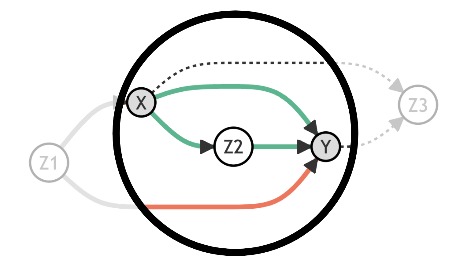
In this case, to assess the causal relationship between $X$ and $Y$ we need to close the path that passes through $Z_1$. We can do that by conditioning the analysis on $Z_1$.
flowchart LR
classDef included fill:#DCDCDC,stroke:#000000,stroke-width:2px;
classDef excluded fill:#ffffff,stroke:#000000,stroke-width:2px;

X((X))
Y((Y))
Z1((Z1))
Z2((Z2))
Z3((Z3))

X --> Y
X --> Z2
Z2 --> Y
Z1 -.-> X
Z1 -.-> Y
X -.-> Z3
Y -.-> Z3

linkStyle 0,1,2 stroke:#00ff00,stroke-width:4px;
class X,Y,Z1 included;
class Z2,Z3 excluded;
Now we are able to recover the causal relationship between $X$ and $Y$ by conditioning on $Z_1$.
What would happen if we were also conditioning on $Z_2$? In this case, we would close the path passing through $Z_2$ leaving only the direct path between $X$ and $Y$ open. We would then recover only the direct effect of $X$ on $Y$ and not the indirect one.
flowchart LR
classDef included fill:#DCDCDC,stroke:#000000,stroke-width:2px;
classDef excluded fill:#ffffff,stroke:#000000,stroke-width:2px;

X((X))
Y((Y))
Z1((Z1))
Z2((Z2))
Z3((Z3))

X --> Y
X -.-> Z2
Z2 -.-> Y
Z1 -.-> X
Z1 -.-> Y
X -.-> Z3
Y -.-> Z3

linkStyle 0 stroke:#00ff00,stroke-width:4px;
class X,Y,Z1,Z2 included;
class Z3 excluded;
What would happen if we were also conditioning on $Z_3$? In this case, we would open the path passing through $Z_3$ which is a spurious path. We would then not be able to recover the causal effect of $X$ on $Y$.
flowchart LR
classDef included fill:#DCDCDC,stroke:#000000,stroke-width:2px;

X((X))
Y((Y))
Z1((Z1))
Z2((Z2))
Z3((Z3))

X --> Y
X -.-> Z2
Z2 -.-> Y
Z1 -.-> X
Z1 -.-> Y
X --> Z3
Y --> Z3

linkStyle 0 stroke:#00ff00,stroke-width:4px;
linkStyle 5,6 stroke:#ff0000,stroke-width:4px;
class X,Y,Z1,Z2,Z3 included;
Example: Class Size and Math Scores
Suppose you are interested in the effect of class size on math scores. Are bigger classes better or worse for students’ performance?
Assume that the data generating process can be represented with the following DAG.
flowchart TB
classDef included fill:#DCDCDC,stroke:#000000,stroke-width:2px;
classDef excluded fill:#ffffff,stroke:#000000,stroke-width:2px;
classDef unobserved fill:#ffffff,stroke:#000000,stroke-width:2px,stroke-dasharray: 5 5;


X((class size))
Y((math score))
Z1((class year))
Z2((good school))
Z3((math hours))
Z4((hist score))
U((ability))

X --> Y
Z1 --> X
X --> Z4
U --> Y
U --> Z4
Z2 --> X
Z2 --> Y
Z2 --> Z4
Z3 --> Y

class X,Y included;
class Z1,Z2,Z3,Z4 excluded;
class U unobserved;
The variables of interest are highlighted. Moreover, the dotted line around ability indicates that this is a variable that we do not observe in the data.
We can now load the data and check what it looks like.
%matplotlib inline
%config InlineBackend.figure_format = 'retina'
from src.utils import *
from src.dgp import dgp_school

df = dgp_school().generate_data()
df.head()
| math_hours | history_hours | good_school | class_year | class_size | math_score | hist_score | |
|---|---|---|---|---|---|---|---|
| 0 | 3 | 3 | 1 | 3 | 15 | 13.009309 | 15.167024 |
| 1 | 2 | 3 | 1 | 3 | 19 | 13.047033 | 13.387456 |
| 2 | 2 | 4 | 0 | 1 | 25 | 8.330311 | 10.824070 |
| 3 | 3 | 4 | 1 | 3 | 22 | 11.322190 | 14.594394 |
| 4 | 3 | 3 | 1 | 4 | 15 | 12.338458 | 11.871626 |
What variables should we condition our regression on, in order to estimate the causal effect of class size on math scores?
First of all, let’s look at what happens if we do not condition our analysis on any variable and we just regress math score on class size.
smf.ols('math_score ~ class_size', df).fit().summary().tables[1]
| coef | std err | t | P>|t| | [0.025 | 0.975] | |
|---|---|---|---|---|---|---|
| Intercept | 12.0421 | 0.259 | 46.569 | 0.000 | 11.535 | 12.550 |
| class_size | -0.0399 | 0.013 | -3.025 | 0.003 | -0.066 | -0.014 |
The effect of class_size is negative and statistically different from zero.
But should we believe this estimated effect? Without controlling for anything, this is DAG representation of the effect we are capturing.
flowchart TB
classDef included fill:#DCDCDC,stroke:#000000,stroke-width:2px;
classDef excluded fill:#ffffff,stroke:#000000,stroke-width:2px;
classDef unobserved fill:#ffffff,stroke:#000000,stroke-width:2px,stroke-dasharray: 5 5;


X((class size))
Y((math score))
Z1((class year))
Z2((good school))
Z3((math hours))
Z4((hist score))
U((ability))

X --> Y
Z1 --> X
X -.-> Z4
U --> Y
U -.-> Z4
Z2 --> X
Z2 --> Y
Z2 --> Z4
Z3 --> Y

linkStyle 0 stroke:#00ff00,stroke-width:4px;
linkStyle 5,6 stroke:#ff0000,stroke-width:4px;

class X,Y included;
class Z1,Z2,Z3,Z4 excluded;
class U unobserved;
There is a spurious path passing through good school that biases our estimated coefficient. Intuitively, being enrolled in a better school improves the students’ math scores and better schools might have smaller class sizes. We need to control for the quality of the school.
smf.ols('math_score ~ class_size + good_school', df).fit().summary().tables[1]
| coef | std err | t | P>|t| | [0.025 | 0.975] | |
|---|---|---|---|---|---|---|
| Intercept | 4.7449 | 0.247 | 19.176 | 0.000 | 4.259 | 5.230 |
| class_size | 0.2095 | 0.010 | 20.020 | 0.000 | 0.189 | 0.230 |
| good_school | 5.0807 | 0.130 | 39.111 | 0.000 | 4.826 | 5.336 |
Now the estimate of the effect of class size on math score is unbiased! Indeed, the true coefficient in the data generating process was $0.2$.
flowchart TB
classDef included fill:#DCDCDC,stroke:#000000,stroke-width:2px;
classDef excluded fill:#ffffff,stroke:#000000,stroke-width:2px;
classDef unobserved fill:#ffffff,stroke:#000000,stroke-width:2px,stroke-dasharray: 5 5;


X((class size))
Y((math score))
Z1((class year))
Z2((good school))
Z3((math hours))
Z4((hist score))
U((ability))

X --> Y
Z1 --> X
X -.-> Z4
U --> Y
U -.-> Z4
Z2 -.-> X
Z2 -.-> Y
Z2 --> Z4
Z3 --> Y

linkStyle 0 stroke:#00ff00,stroke-width:4px;

class X,Y,Z2 included;
class Z1,Z3,Z4 excluded;
class U unobserved;
What would happen if we were to instead control for all variables?
smf.ols('math_score ~ class_size + good_school + math_hours + class_year + hist_score', df).fit().summary().tables[1]
| coef | std err | t | P>|t| | [0.025 | 0.975] | |
|---|---|---|---|---|---|---|
| Intercept | -0.7847 | 0.310 | -2.529 | 0.012 | -1.394 | -0.176 |
| class_size | 0.1292 | 0.010 | 13.054 | 0.000 | 0.110 | 0.149 |
| good_school | 2.9815 | 0.170 | 17.533 | 0.000 | 2.648 | 3.315 |
| math_hours | 1.0516 | 0.048 | 21.744 | 0.000 | 0.957 | 1.147 |
| class_year | 0.0424 | 0.037 | 1.130 | 0.259 | -0.031 | 0.116 |
| hist_score | 0.4116 | 0.027 | 15.419 | 0.000 | 0.359 | 0.464 |
The coefficient is again biased. Why?
We have opened a new spurious path by controlling for hist score. In fact, hist score is a collider and controlling for it has opened a path through hist score and ability that was otherwise closed.
flowchart TB
classDef included fill:#DCDCDC,stroke:#000000,stroke-width:2px;
classDef excluded fill:#ffffff,stroke:#000000,stroke-width:2px;
classDef unobserved fill:#ffffff,stroke:#000000,stroke-width:2px,stroke-dasharray: 5 5;


X((class size))
Y((math score))
Z1((class year))
Z2((good school))
Z3((math hours))
Z4((hist score))
U((ability))

X --> Y
Z1 --> X
X --> Z4
U --> Y
U --> Z4
Z2 -.-> X
Z2 -.-> Y
Z2 --> Z4
Z3 --> Y

linkStyle 0 stroke:#00ff00,stroke-width:4px;
linkStyle 2,3,4 stroke:#ff0000,stroke-width:4px;

class X,Y,Z1,Z2,Z3,Z4 included;
class U unobserved;
The example was inspired by the following tweet.
We can illustrate this with Model 16 of the "Crash Course in Good and Bad Controls" (https://t.co/GcSNzhuVt2). Here X = class size, Y = math4, Z = read4, and U = student's ability. Conditioning on Z opens the path X -> Z <- U -> Y and it is thus a "bad control." https://t.co/KNfqtsMWwB pic.twitter.com/lUSigNYSJj
— Análise Real (@analisereal) March 12, 2022
Conclusion
In this post, we have seen how to use Directed Acyclic Graphs to select control variables in a causal analysis. DAGs are very helpful tools since they provide an intuitive graphical representation of causal relationships between random variables. Contrary to common intuition that “the more information the better”, sometimes including extra variables might bias the analysis, preventing a causal interpretation of the results. In particular, we must pay attention not to include colliders that open spurious paths that would otherwise be closed.
References
[1] C. Cinelli, A. Forney, J. Pearl, A Crash Course in Good and Bad Controls (2018), working paper.
[2] J. Pearl, Causality (2009), Cambridge University Press.
[3] S. Cunningham, Chapter 3 of The Causal Inference Mixtape (2021), Yale University Press.
I hold a PhD in economics from the University of Zurich. Now I work at the intersection of economics, data science and statistics. I regularly write about causal inference on Medium.